Deriv Dashboard
Three years after launching Deriv's first centralized dashboard, CFD trading had become the main product, but users were struggling to navigate all the options. I led a team to evolve the dashboard from a discovery-focused hub to something built for conversion.
My Role
As UI/UX Manager, I:
- •Led the strategic redesign of the 2022 dashboard for 2025 market needs
- •Analyzed support tickets and user feedback to identify pain points
- •Redesigned information architecture with dedicated navigation for CFDs, Options, and Portfolio
- •Simplified CFD account discovery and creation process
From Success to Evolution
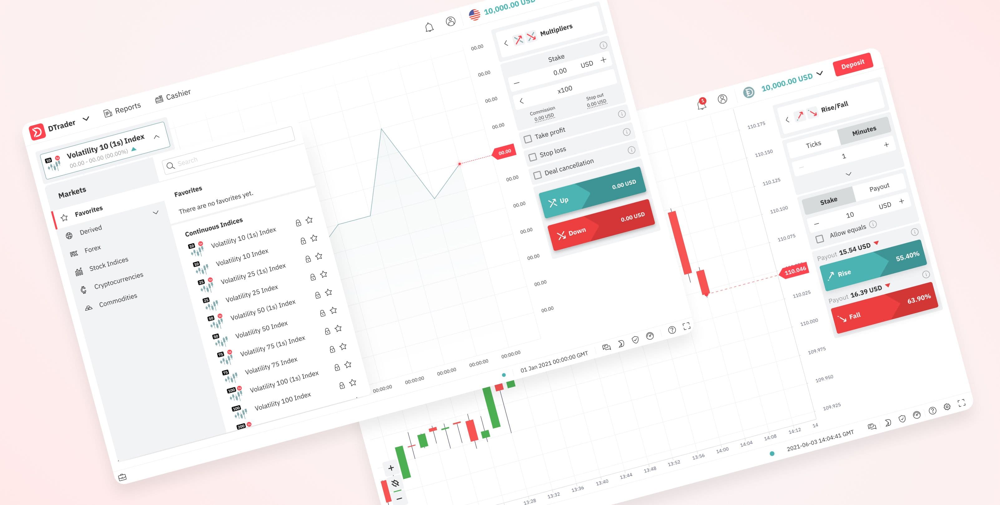
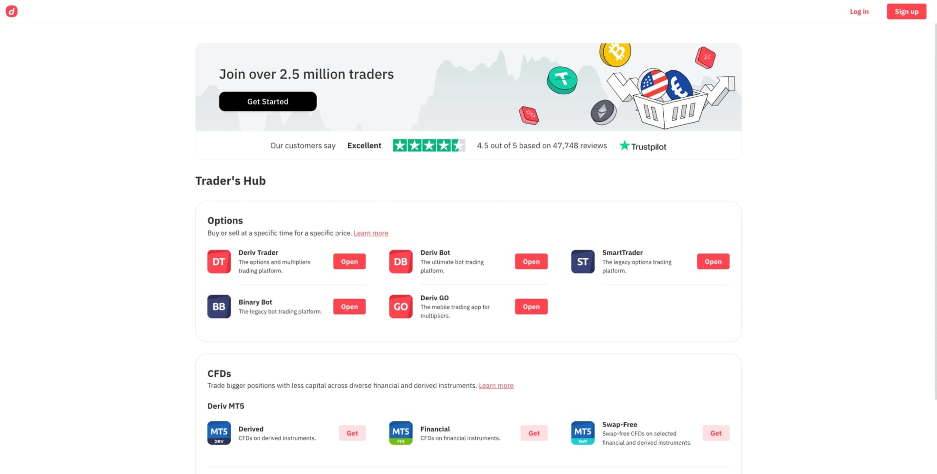
In 2022, Deriv launched its first centralized dashboard, the Trader's Hub. It solved a real problem: users no longer had to guess which account to choose from our 10+ options. The design focused on discoverability, and funding rates climbed from 3% to 5%.
By 2025, the landscape had shifted. Clients moved from Options to CFD trading on MetaTrader 5. CFD adoption jumped from 43% to 86%. New users needed CFD accounts, but our dashboard was still optimized for Options. Time to redesign for CFD conversion.
The 2022 Trader's Hub - successful for Options discovery, insufficient for CFD complexity
Testing Reveals the Gap
I led the team to run user testing with 100 people: 50 existing Deriv clients and 50 non-Deriv users with no CFD experience. The gap was huge. Experienced traders knew exactly what they needed. New users could not tell the difference between Standard, Swap-Free, and Zero Spread accounts. They saw a wall of options with no context and gave up.
Testing with Existing Deriv Clients
Smooth sailing
Task completion rate
They understood account differences
Testing with Non-Deriv CFD Beginners
Revealing struggles
Task completion rate
Most needed help choosing accounts
Recurring Confusion from New Users
Common questions during testing sessions
"What is the difference between these accounts?"
"Which one should I choose?"
"What if I pick the wrong one?"
"I will ask support first"
The Design Solution: Focused Navigation
The core problem was clear: users could not navigate CFD account complexity when everything was jumbled together. My solution? Separate and focus. I redesigned the information architecture around four dedicated navigation sections, each with a specific purpose in the user journey.
This was not about adding more features, it was about creating clarity through separation. Each section would be a focused space where users could get specific tasks done without distraction or confusion.
Four-Part Navigation System
Each section with a distinct purpose
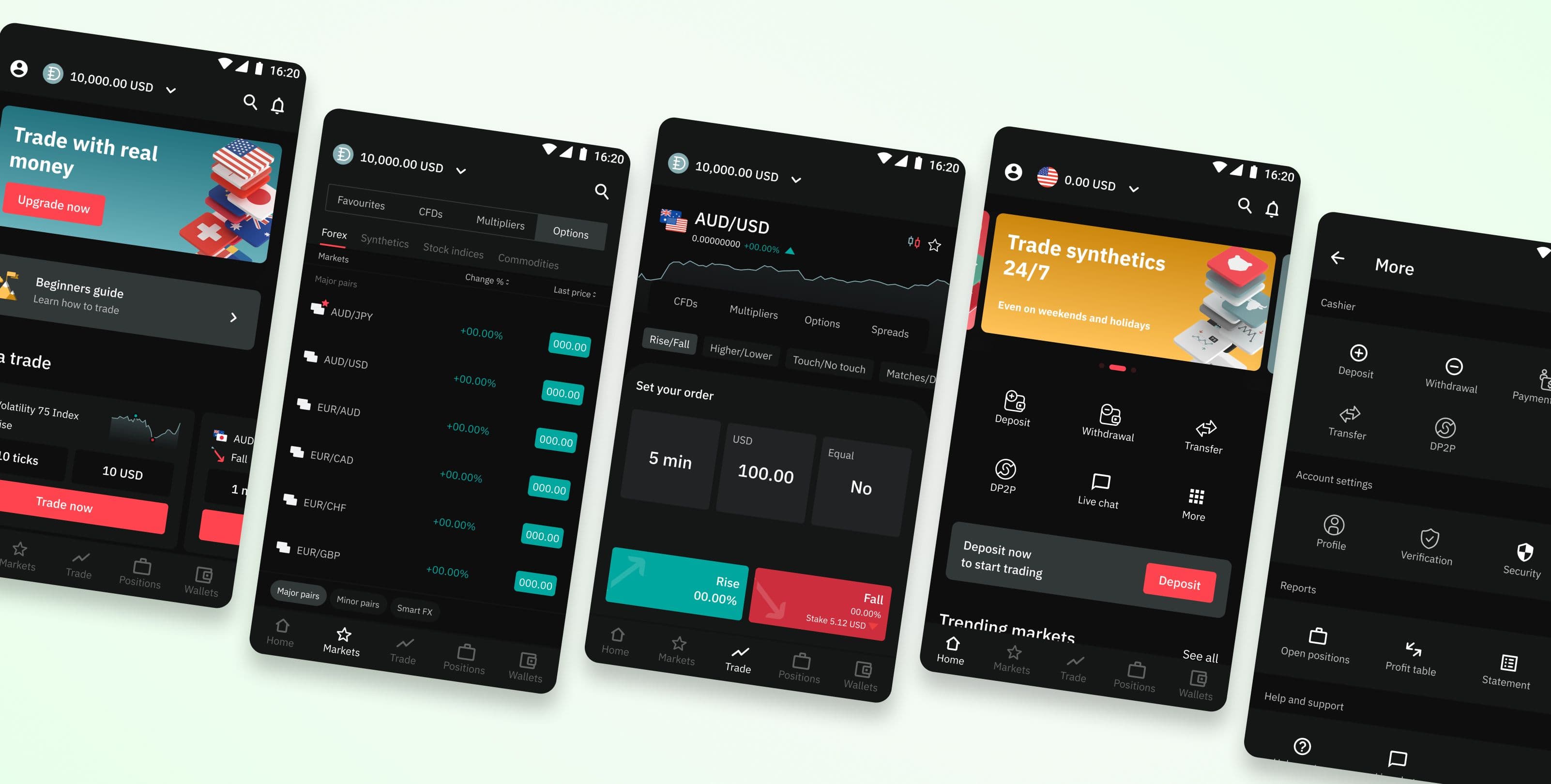
1. Home
Gateway to real trading
- • Prominent KYC verification banner
- • Quick shortcuts to Deposit
- • Popular CFD accounts display
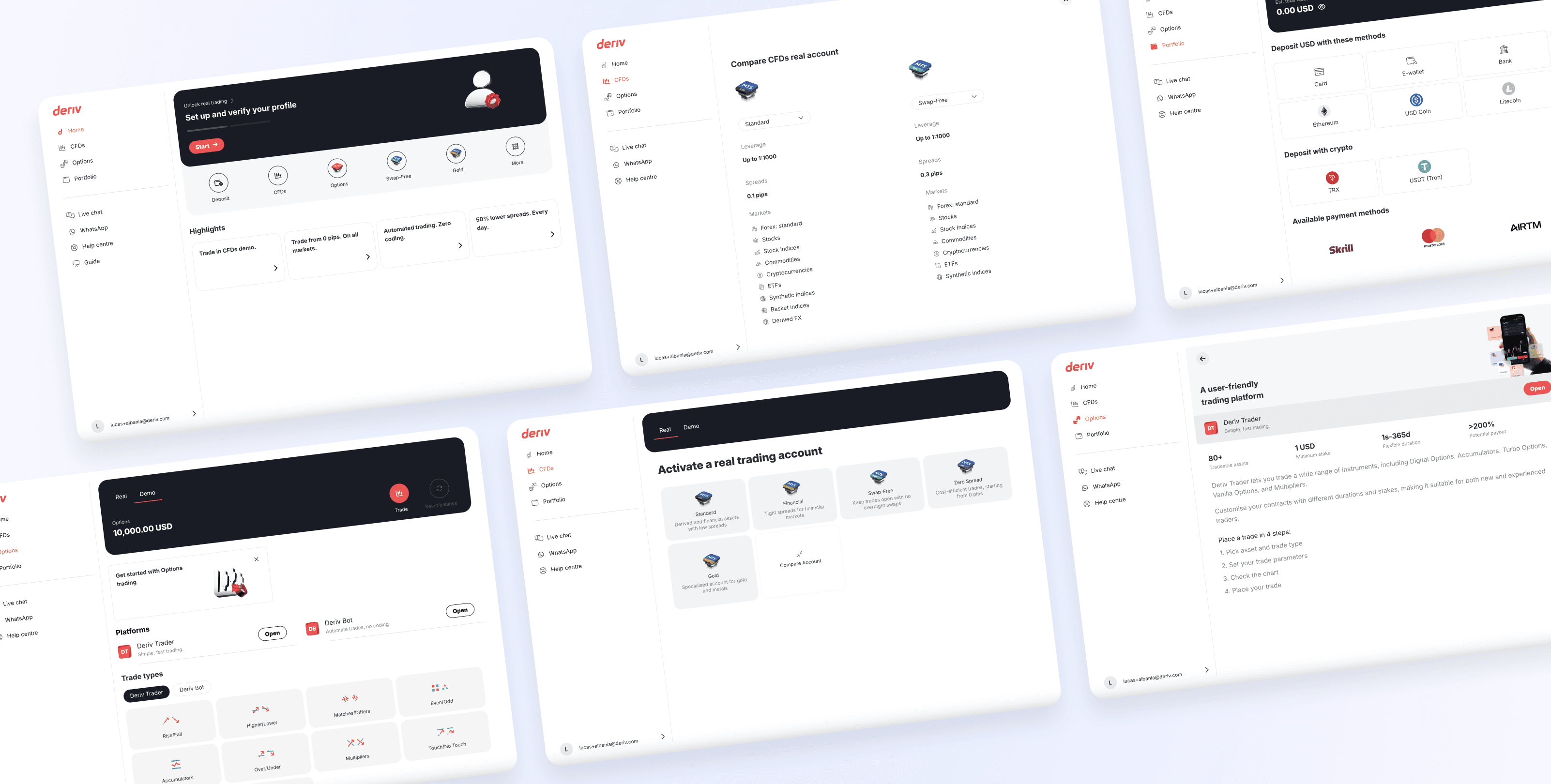
2. CFDs
Dedicated CFD focus
- • All CFD account types
- • Side-by-side comparison
- • Quick account creation
3. Options
Options trading hub
- • Platform selection (DTrader, DBot)
- • Trade type explanations
- • Beginner-friendly details
4. Portfolio
Wallet management
- • Deposit & withdraw flows
- • Multiple payment methods
- • Transaction history
How Segregation Improved User Experience
The separated navigation changed everything. By splitting information into dedicated pages, I got rid of the overwhelming "everything everywhere" problem. Users could now focus on one task at a time, while still having easy access to other sections through the navigation.
Focused Exploration
When users clicked "CFDs," they entered a dedicated space showing only CFD accounts. No Options platforms. No wallet information. Just CFDs, with comparison tools, clear descriptions, and streamlined account creation.
Result: CFD demo account creation reduced from 6 minutes to 2 minutes
Maintained Discoverability
Even with the separation, users never lost sight of other options. The navigation bar let them switch between CFDs, Options, and Portfolio anytime. The design separated for focus, not to trap people.
Result: No decrease in product awareness
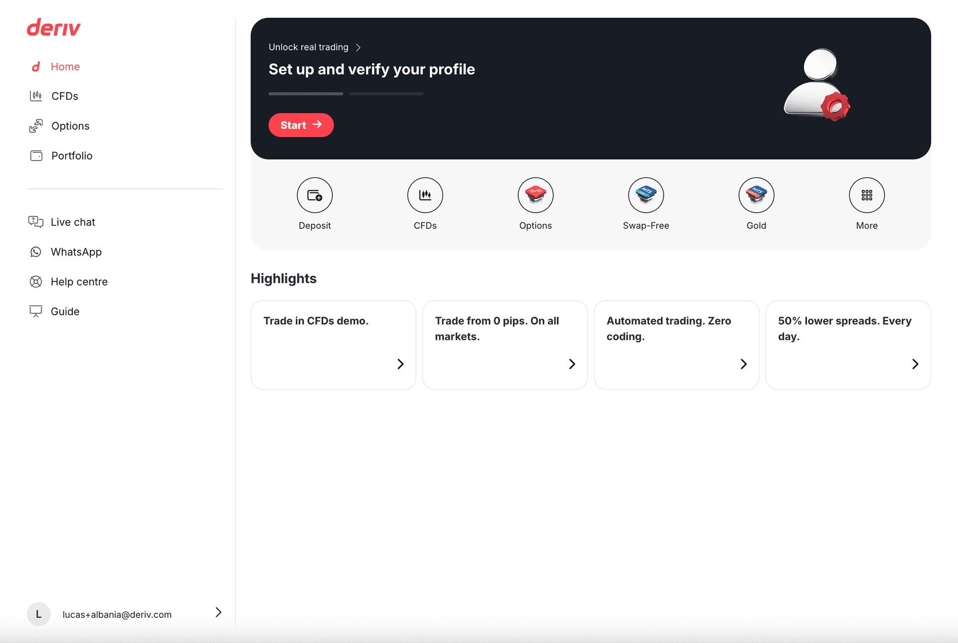
Home: Verification banner and quick shortcuts
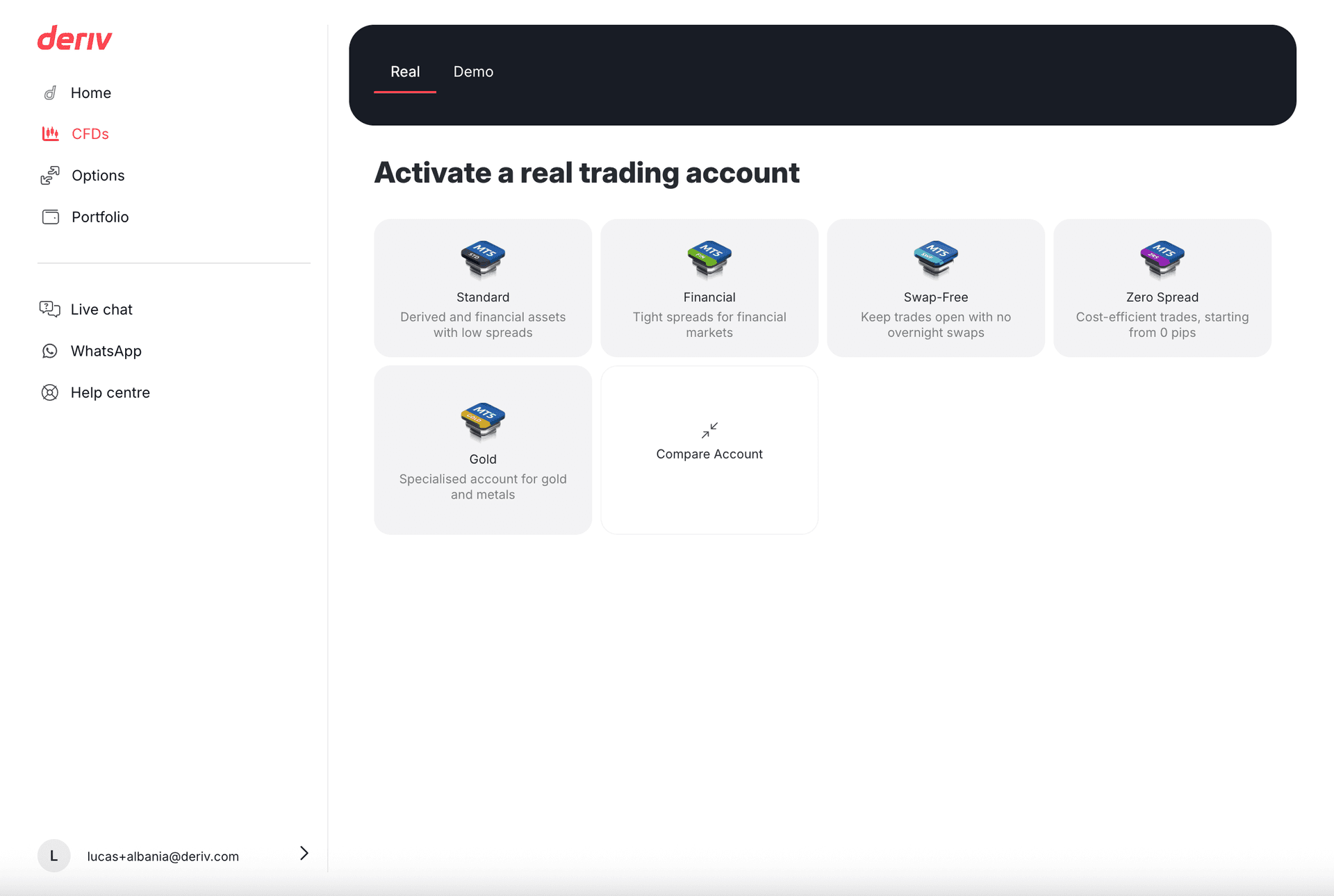
CFDs: Dedicated account selection page
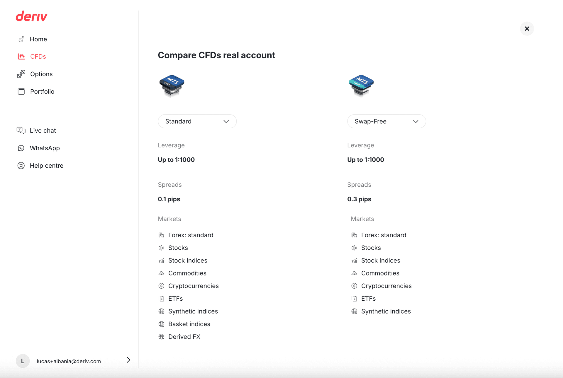
CFDs: Side-by-side account comparison tool
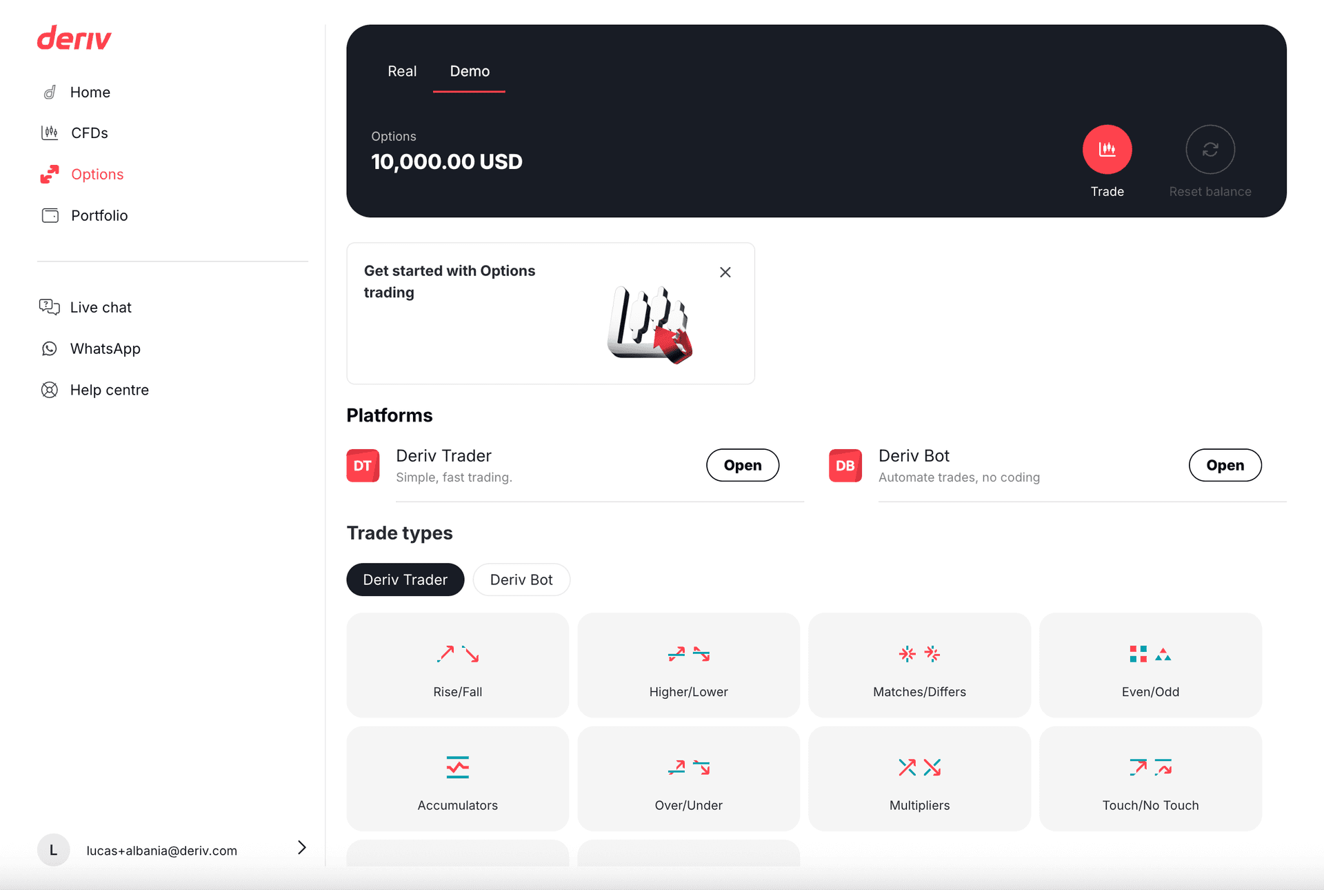
Options: Platform and trade type focus
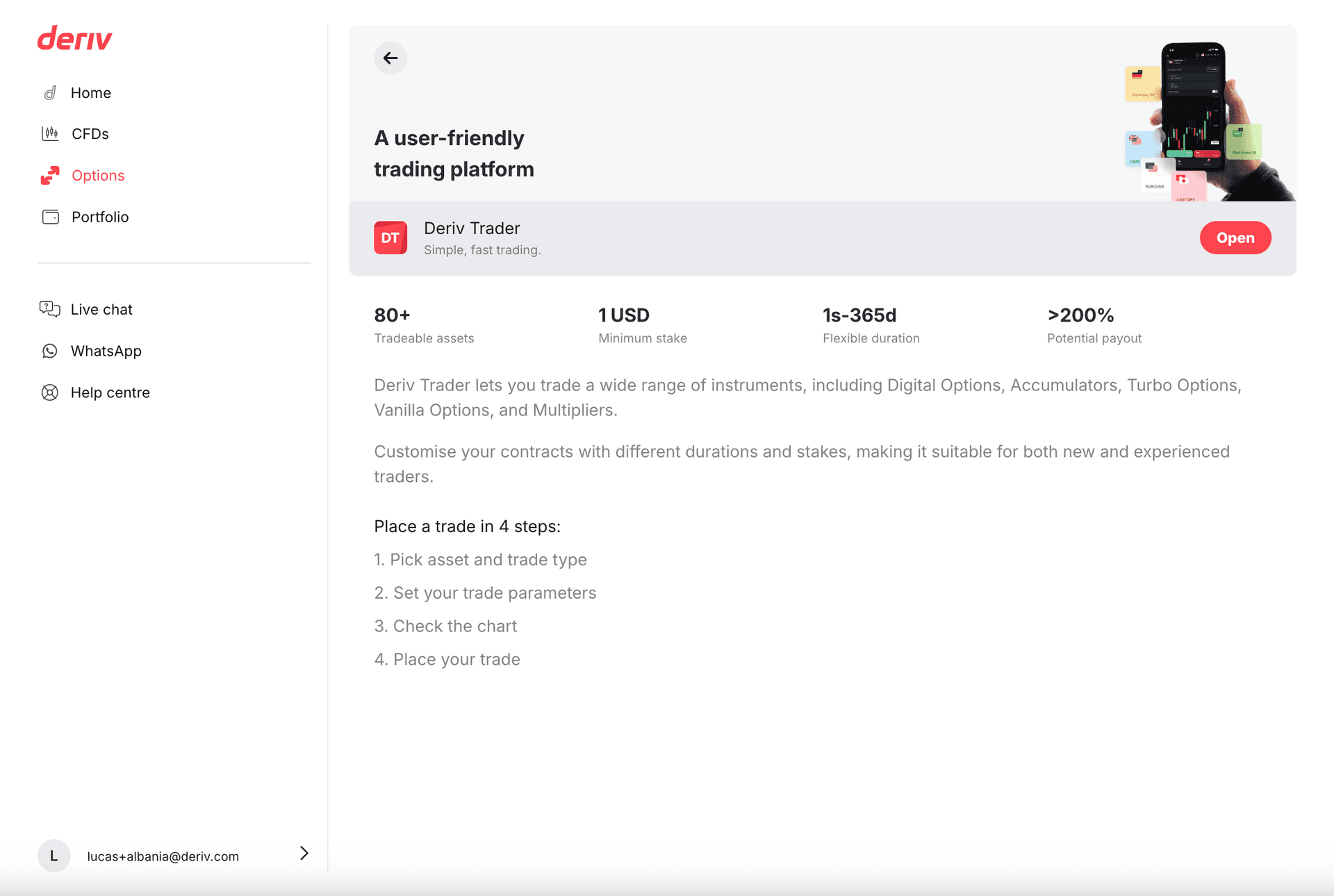
Options: Detailed DTrader platform information
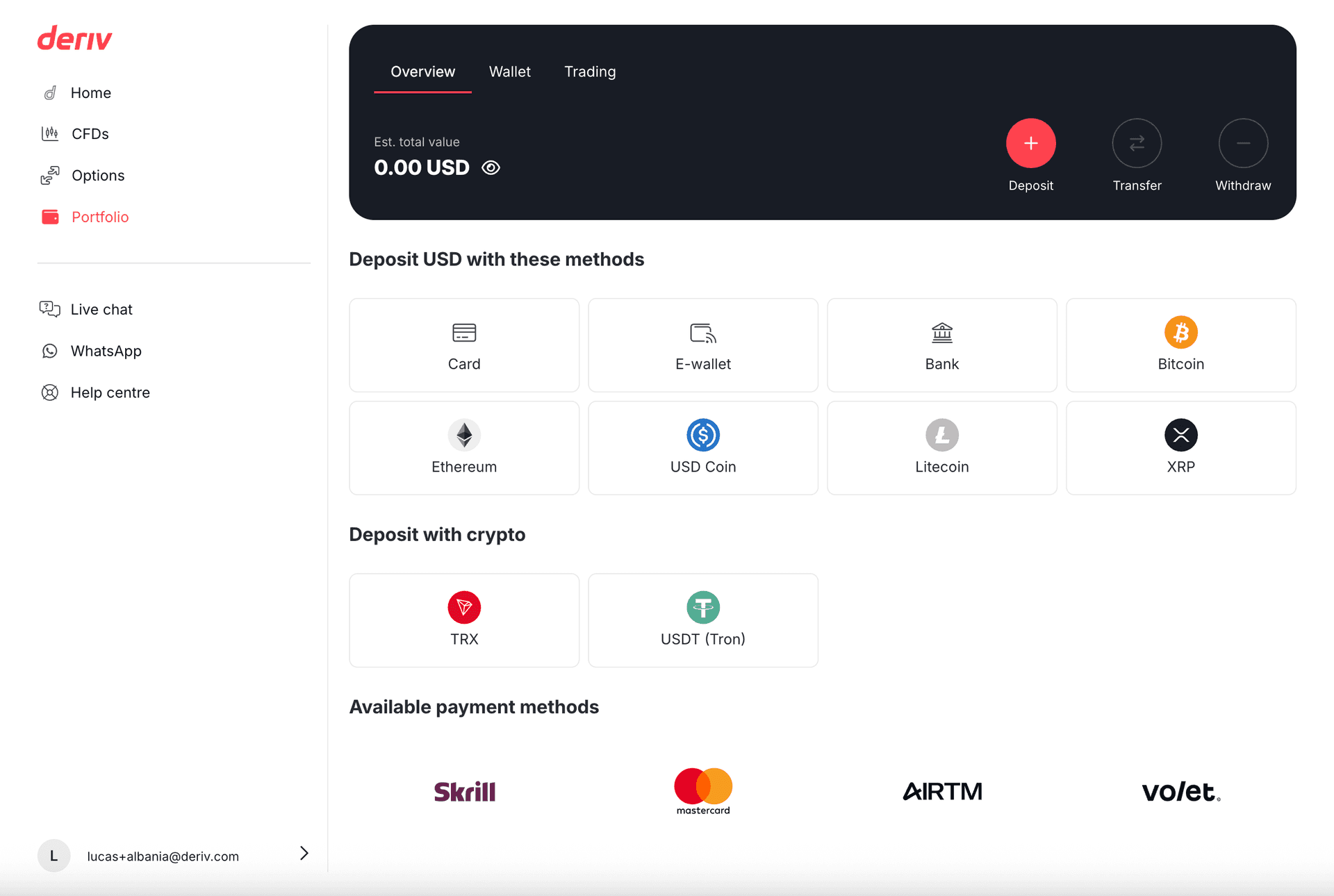
Portfolio: Wallet and transaction management
The balance between focus and findability was key. Users appreciated the clarity of dedicated pages without feeling stuck. This approach to separating things became a model for future product launches at Deriv.
Measurable Impact
The 2025 redesign delivered what I set out to do: less confusion, better conversion. By centering the experience around CFD accounts, users now have the clarity they needed to make confident decisions and fund their accounts.
Key Wins
Funding Rate
Funding rate increased (North Star metric)
Support Tickets
Reduction in CFD-related support tickets
Account Creation
CFD demo account creation for new users
Comparison Tool
Users successfully used comparison tool
The 2025 redesign proved that sometimes the best solution is not adding more. It is reorganizing what you already have for clarity and focus.