Deriv Legacy Web App
In early 2019, I led a 6-month mission to transform Deriv's 20-year-old trading app into a modern, user-friendly platform. My goal was to improve user experience and increase organic sign-ups.
My Role
As the most experienced UI/UX Designer on the team, I:
- •Led the design efforts for the 6-month transformation project
- •Conducted 10 user interviews (team of 5 designers conducted 50 total)
- •Created 3 design iterations based on user feedback
- •Developed design system with 85 reusable components
Legacy Software
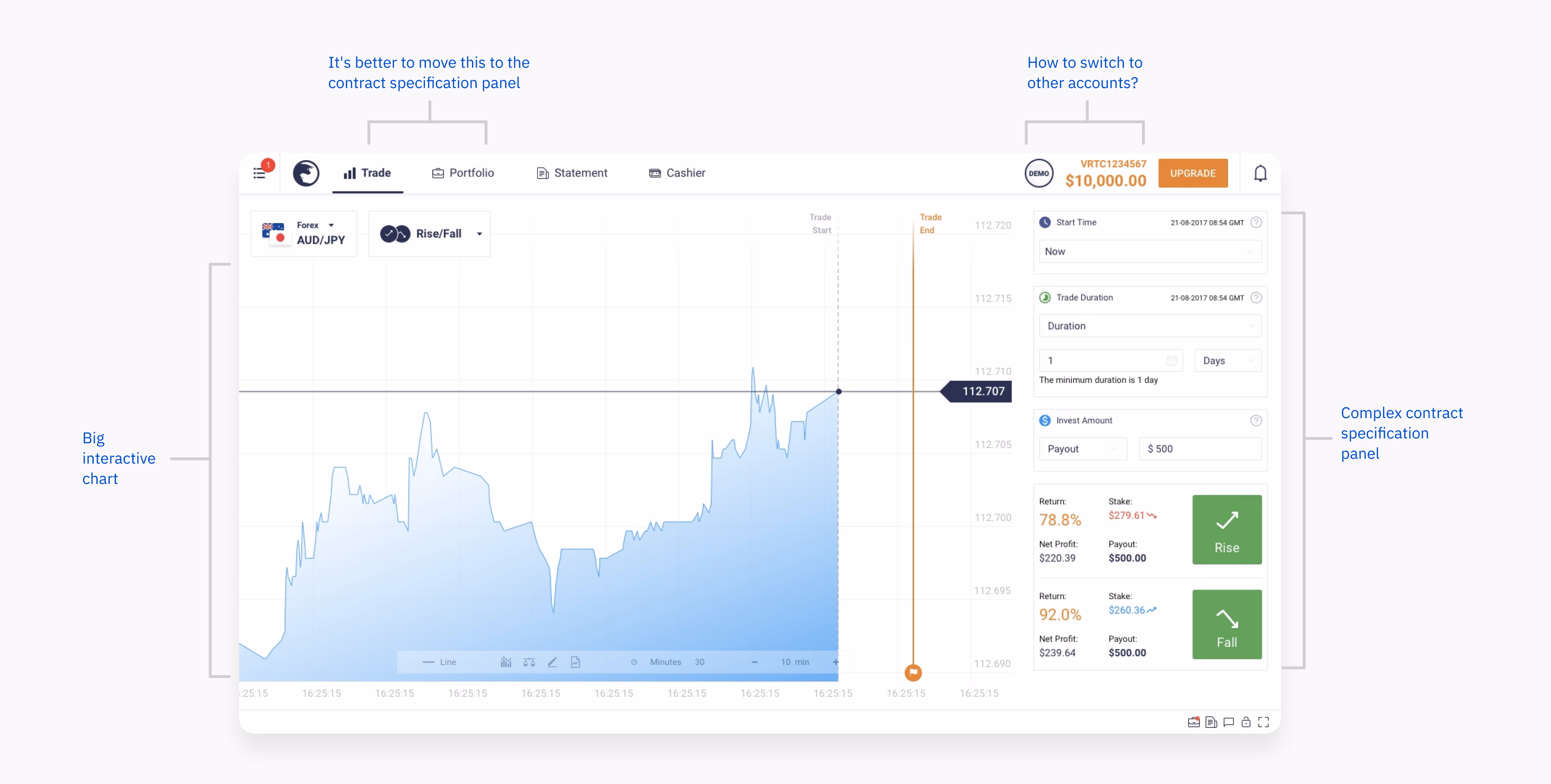
Founded in 1999, Binary.com's trading app was a pioneer in web-based trading software. However, over the years, its design remained stuck in the early 2000s while competitors moved to clean, intuitive interfaces. The dated look raised security concerns and created friction in the user experience. This led to stagnant growth and low retention rates.
Binary.com
IQ Options
Adaptation Challenges
By early 2019, with only 2.1% of visitors signing up, the need for a major change was obvious. Additionally, new competitors, especially IQ Option, posed a real threat to Binary.com's market position.
Competitive Landscape
The rebrand from Binary.com to Deriv.com gave our five-person UI/UX team the opportunity to completely revamp the app and regain competitive advantage.
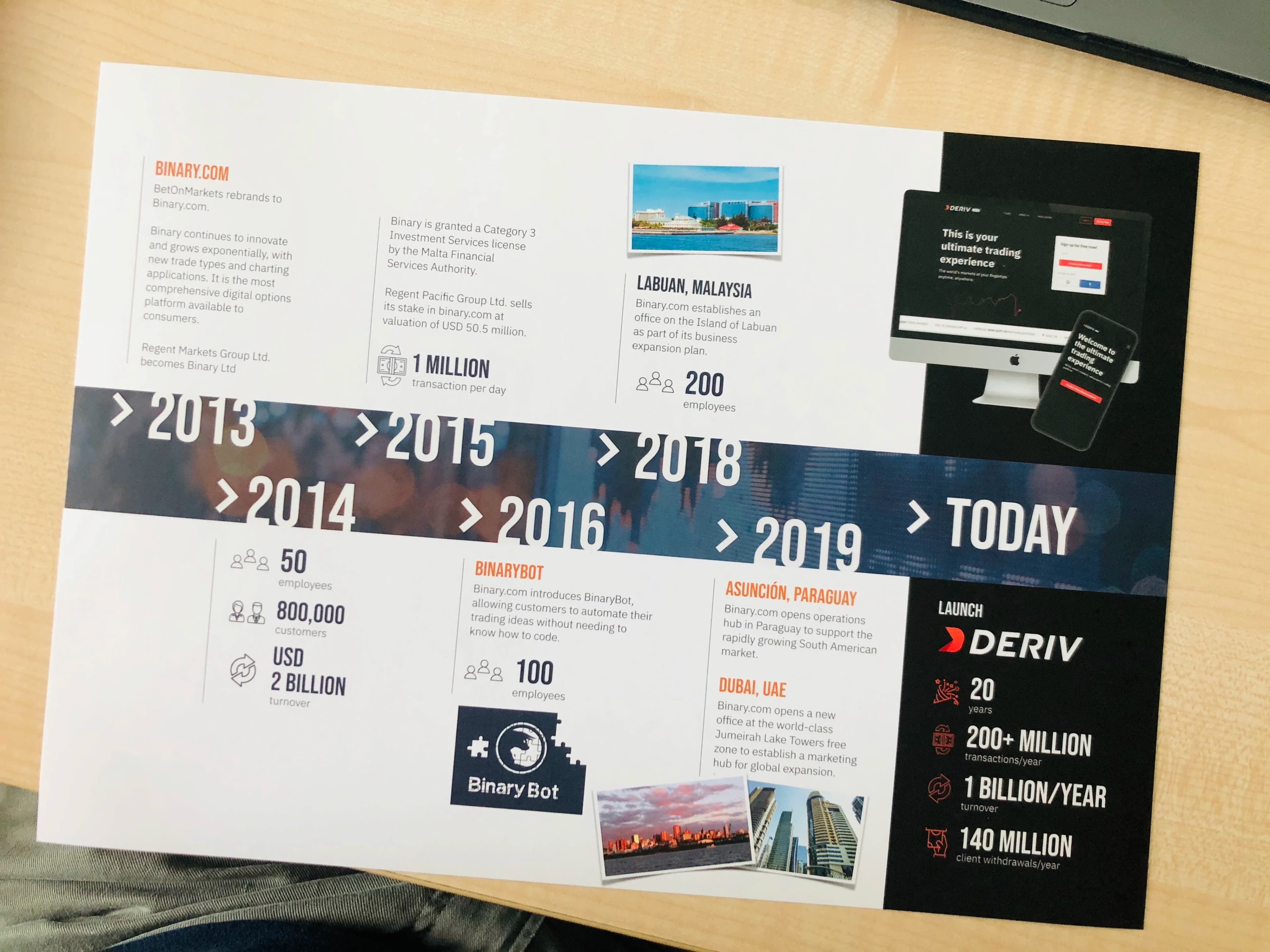
Rebrand to Deriv
Identifying Issues
To understand user pain points and needs, I led an extensive data-gathering process, conducting user interviews and collaborating with various teams.
These efforts revealed key areas for improvement, particularly in usability and functionality.
Research Findings
From 50 user interviews and analytics data:
- 73% relied on trial-and-error clicking to learn, creating a steep learning curve
- 45% questioned platform security due to dated design
- 65% felt cheated without visual trade feedback on charts
- Testers gave up after an average of 2.3 minutes, telling us they did not know what to do
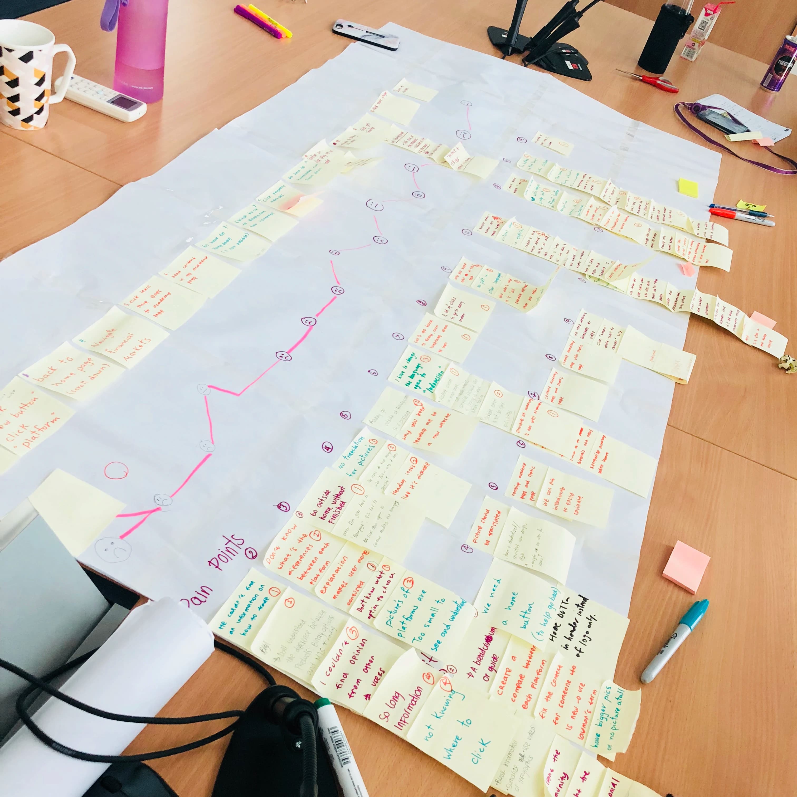
Emotional Journey Map
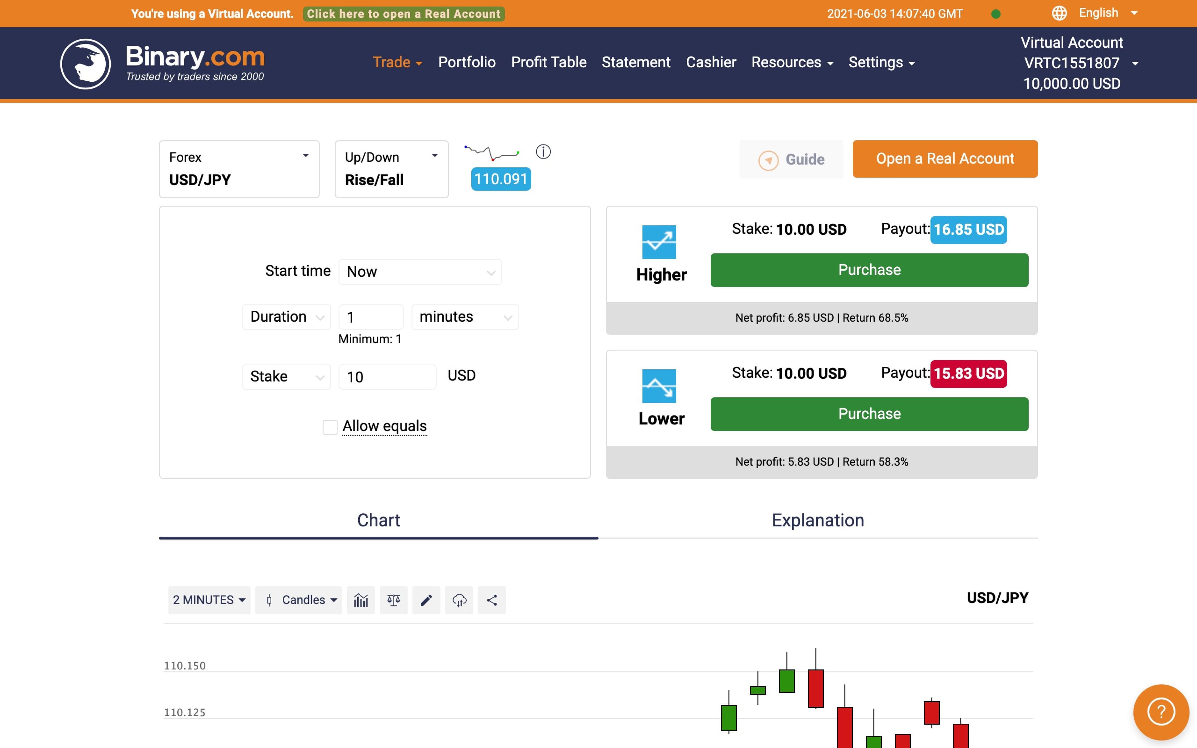
First Mockup
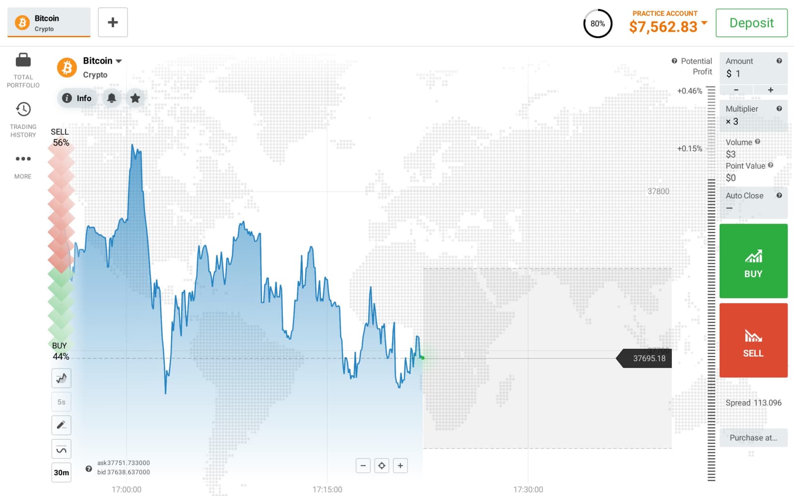
Research showed 65% of users felt cheated without visual feedback on charts, so I made the chart my priority. The tricky part was the contract panel. It had to handle Deriv's complex options clearly. User testing showed the first version was too complicated, so I simplified it in the second mockup.
What changed:
- • Chart became 60% of interface (vs 30% before)
- • Show all fields in Contract Panel
- • Result: Still too complex (67% completion rate)
First Mockup
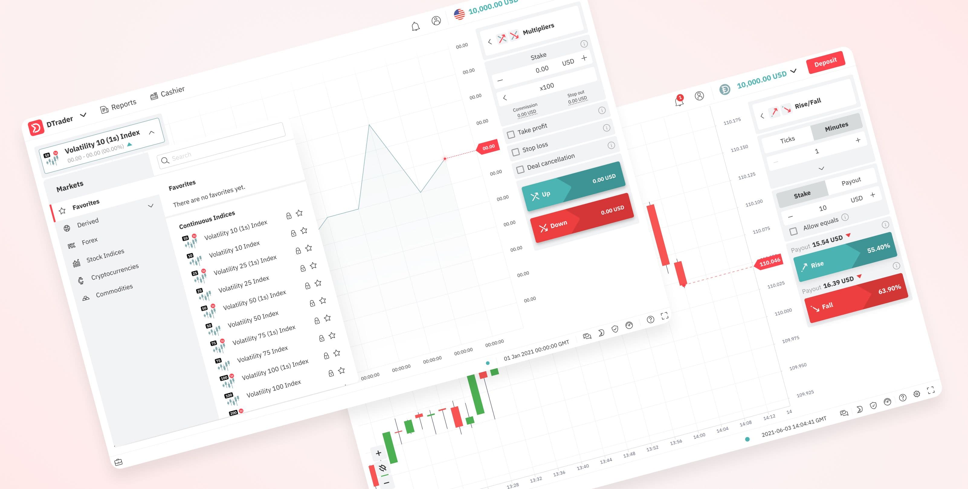
Second Mockup
Addressing the feedback, I led the redesign of the contract specification panel. The goal was to integrate the contract type dropdown into the panel without compromising usability. This led to a more intuitive and streamlined interface, reducing clutter and improving user experience.
Improvements:
- • Progressive disclosure: 3 core fields → expand for more
- • Result: 89% completion rate in user testing
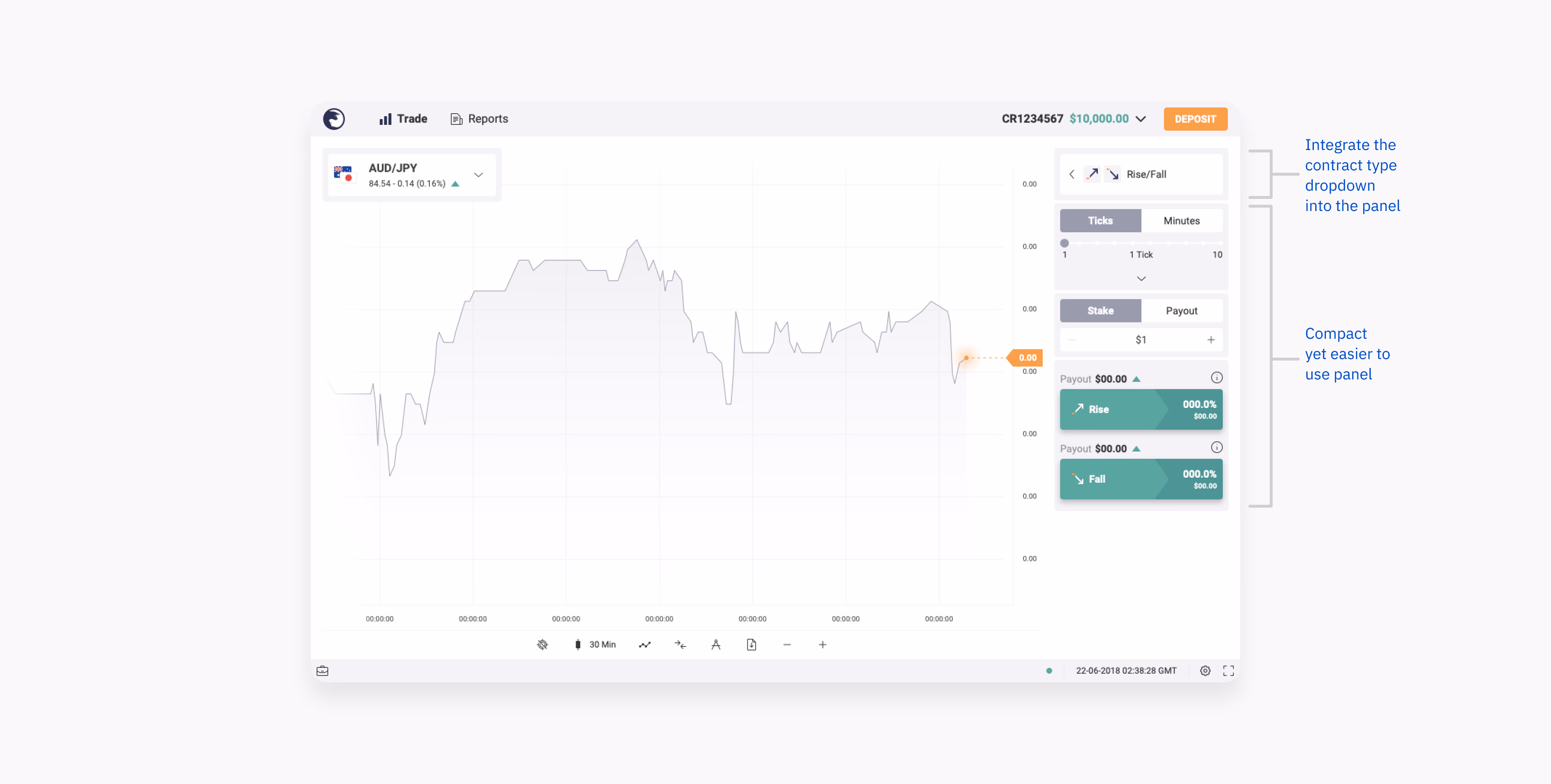
Second Mockup
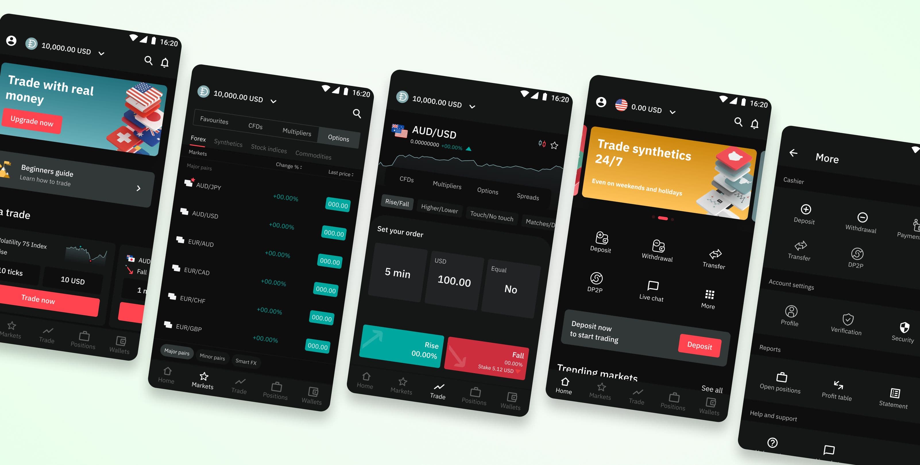
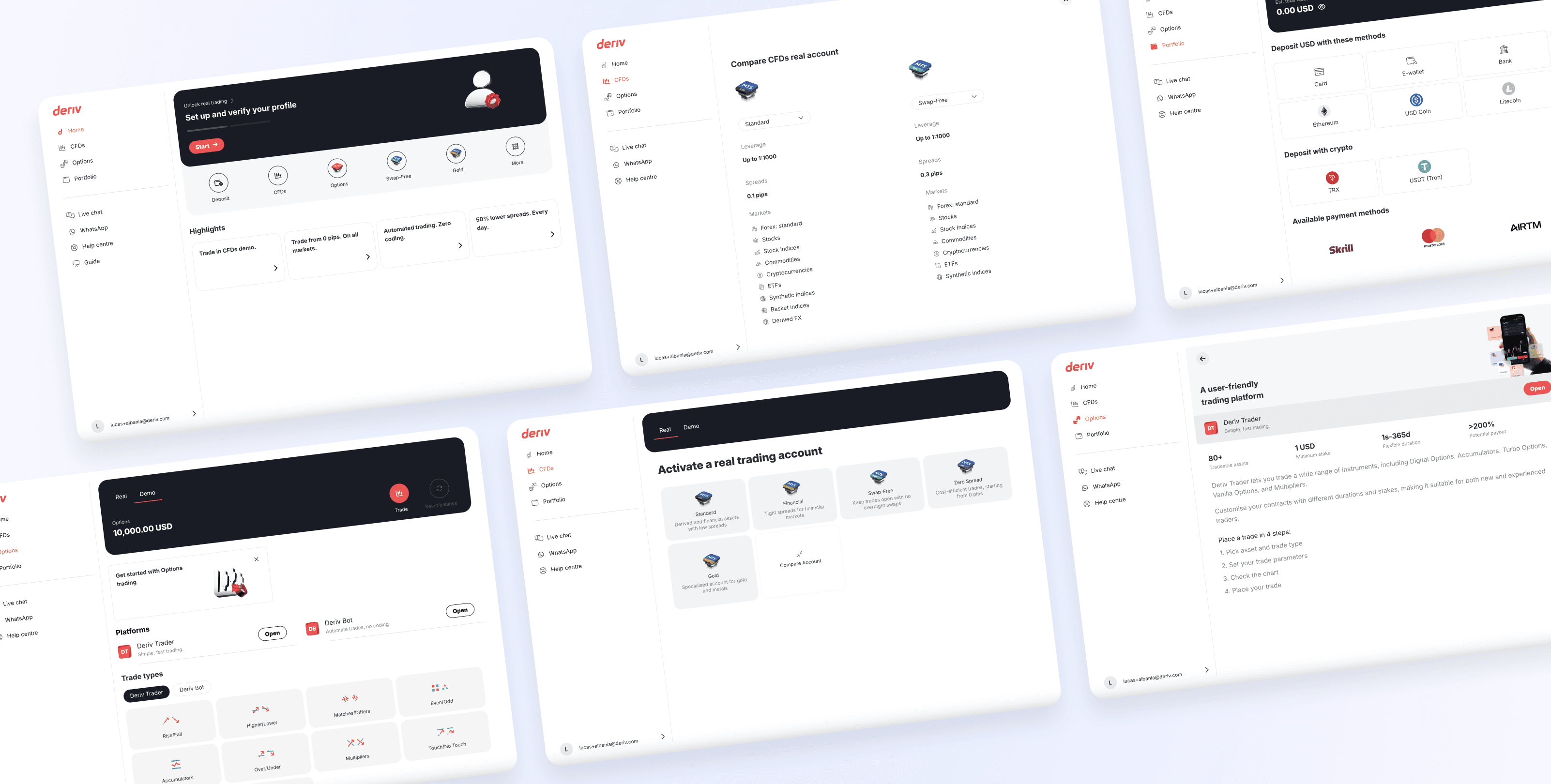
Final Result
After months of refinement, the revamped app was unveiled at Binary's 20th-anniversary event in September 2019. At this event, the CEO announced the rebrand to Deriv and showcased the new trading platform for the first time. The response was overwhelmingly positive, with notable increases in user engagement and sign-ups.
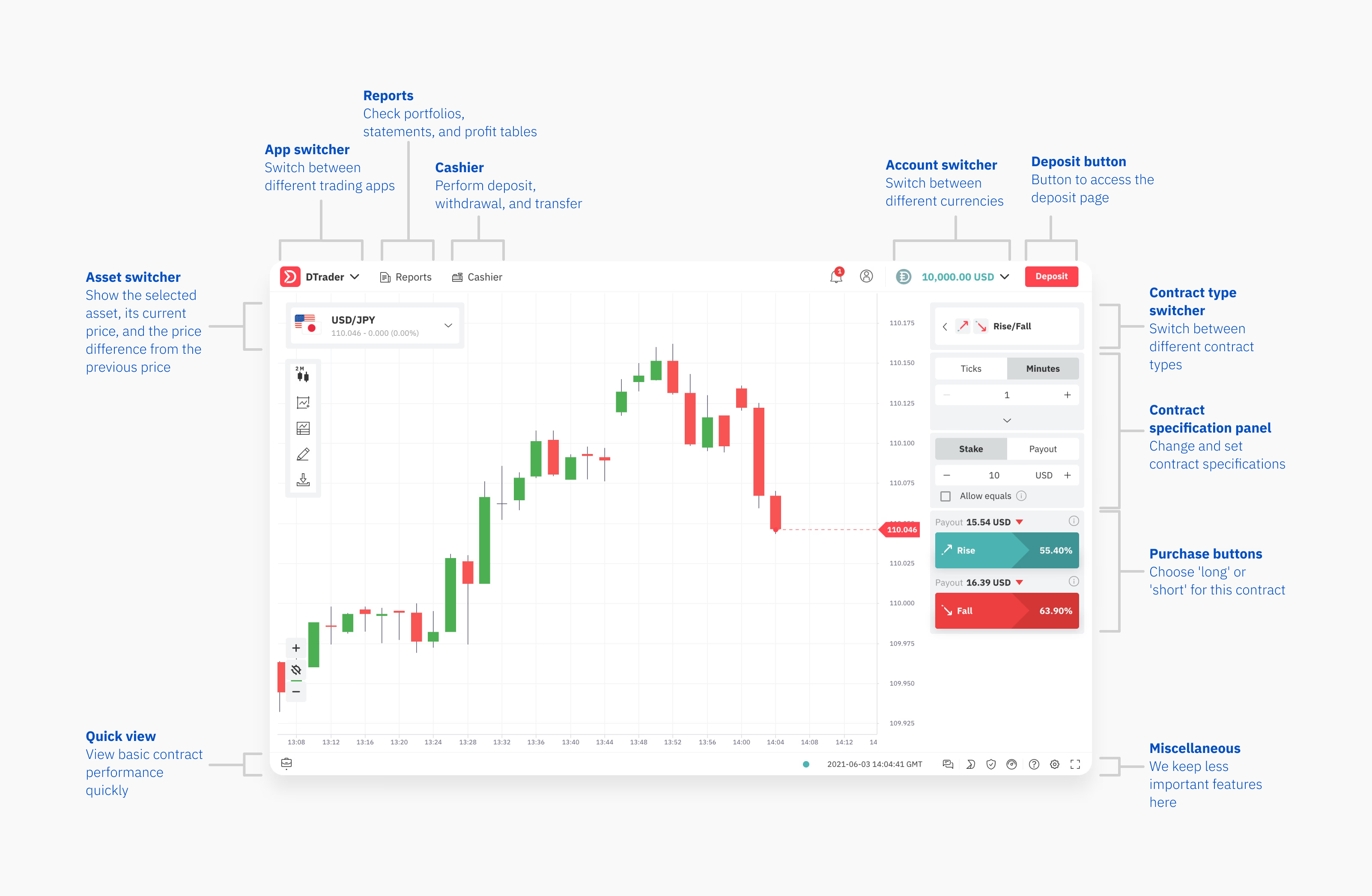
Final Result
Impact
Sign-ups
In 12 months
Time to Trade
Average time to first confident trade
Sign-up Conversion
Visitor-to-sign-up conversion rate
Deposit Conversion
First deposit conversion rate
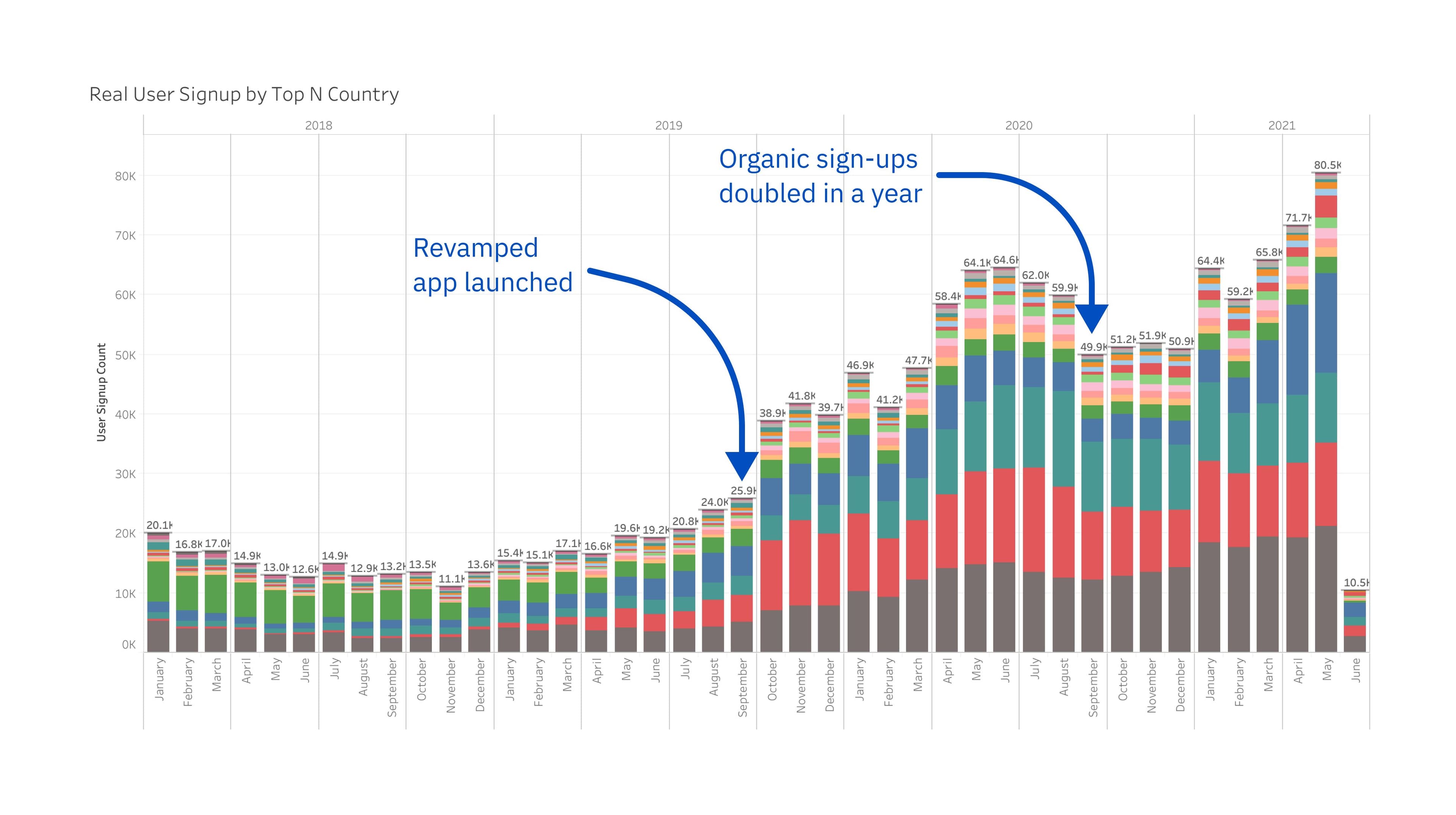
By September 2020, the transformation had exceeded all expectations, reflecting the success of the project and the company's renewed growth trajectory. The project's success led to my promotion to UI/UX Team Lead by the end of 2019.