Initial Release of the Trader's Hub
The Amazon of Trading
Our vision was to become the Amazon of trading, providing a central hub for all products. The initial release of the Trader’s Hub was a simplified version due to business pressures, which likely contributed to the stagnant conversion rate.
Educational Pages
The original concept included educational pages to explain our products, from assets and types of trading (CFDs and Options) to platforms and accounts. We aimed to detail which assets are supported by different trading types and their compatibility with various platforms and accounts. However, the complexity and time required exceeded expectations, leading the company to launch without these pages.
Educational Pages
Our initial user testing involved existing customers familiar with trading, resulting in biased feedback. Realizing this, I decided to conduct tests with individuals new to trading. Insights from these tests aligned with our original vision, highlighting the need for a more comprehensive design.
Insights from Scorebuddy
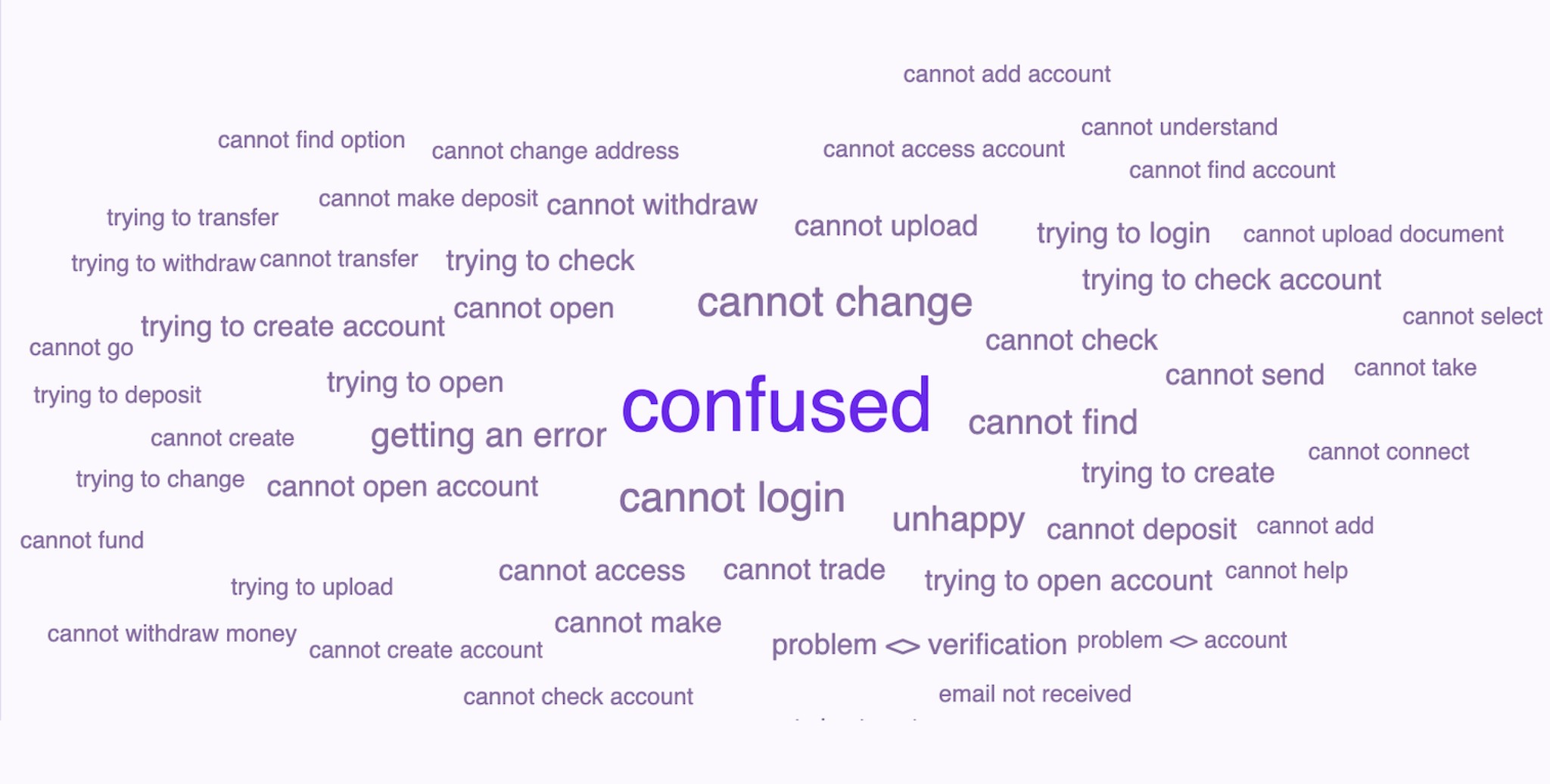
Confusion
New users found the dashboard confusing and overwhelming. They struggled to locate desired stocks and were confronted with unfamiliar terms like Options and CFDs. Insights collected from Scorebuddy, our customer service software, also indicated that confusion was the main challenge raised by users. This led to a poor user experience, as one tester aptly summarized: “I don’t know what I am doing.”
Decision Overload
New users face numerous decisions: choosing assets (e.g., Apple, Nvidia), deciding between CFDs or Options, selecting trading platforms, and understanding payment methods. Without clear guidance, these choices are intimidating and deter investment. To address this, we aimed to simplify and clarify each decision point.
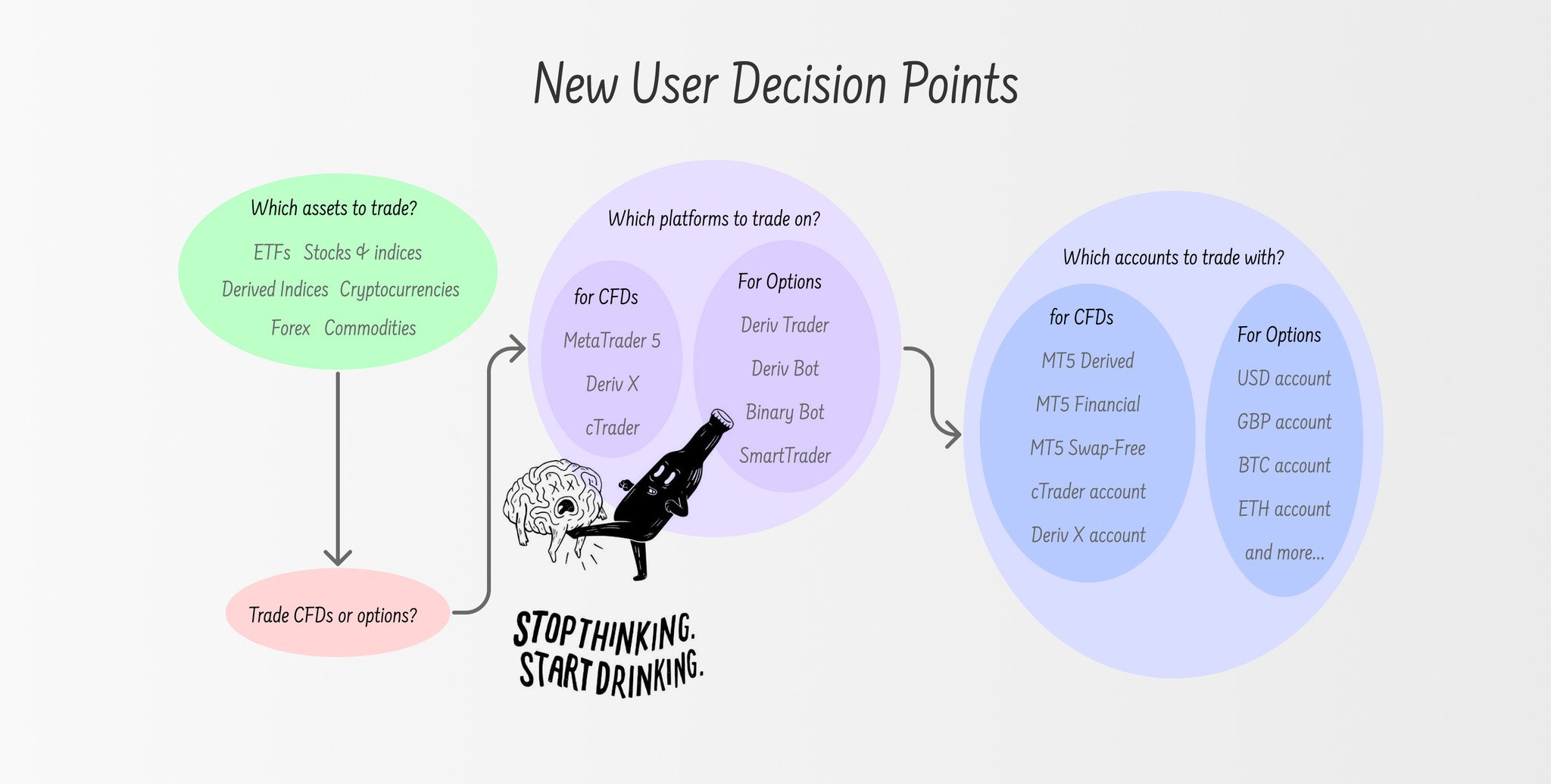
A Series of Decisions
Crazy Ideas from Brainstorming Sessions
Starting from Scratch
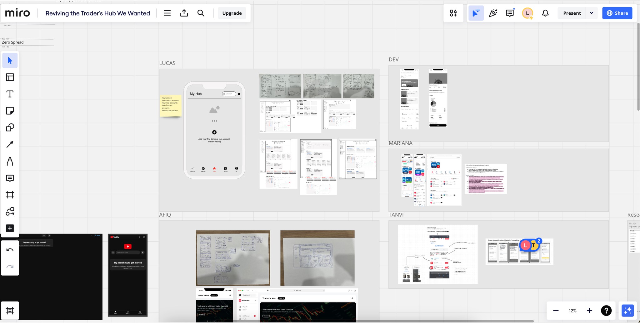
Armed with new insights, the team received approval to redesign the dashboard from scratch. Our goal was to enhance discoverability, findability, and usability, guiding users through their decisions at their own pace. We used Miro to collect and integrate sketches of different designers' ideas, fostering a collaborative and creative process.
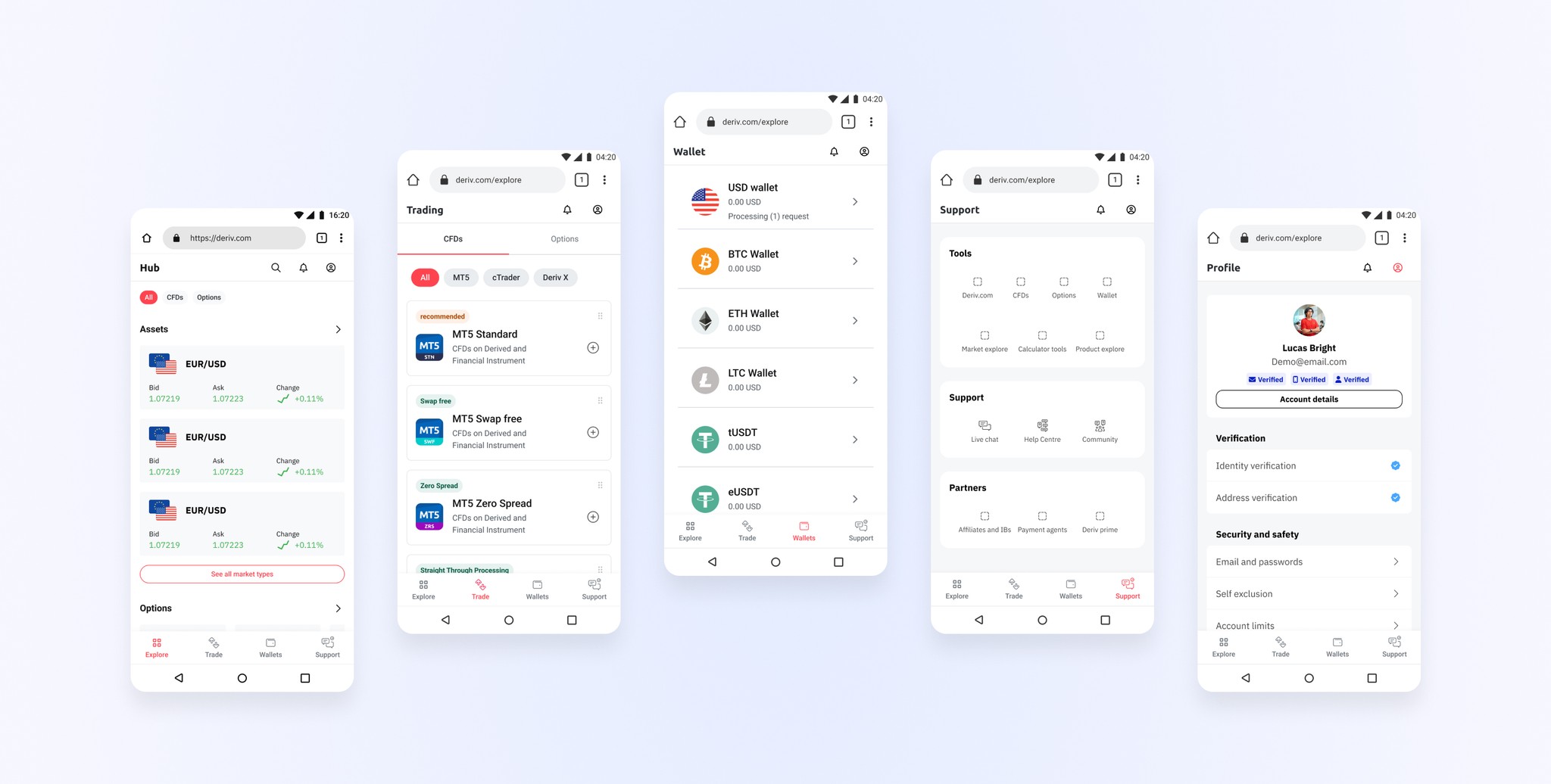
Restructuring Information Architecture
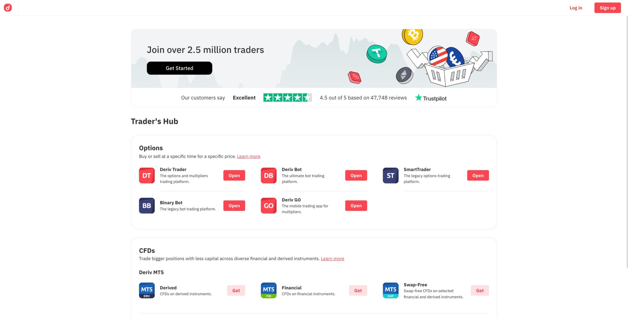
We restructured the information architecture using a bottom bar with four sections: Explore, Trade, Wallets, and Support. The Explore section educates users on assets, trading types, and decision-making processes. The Trade section displays available accounts, Wallets manage funds, and Support offers assistance and resources.
Explore, Trade, Wallets, and Support
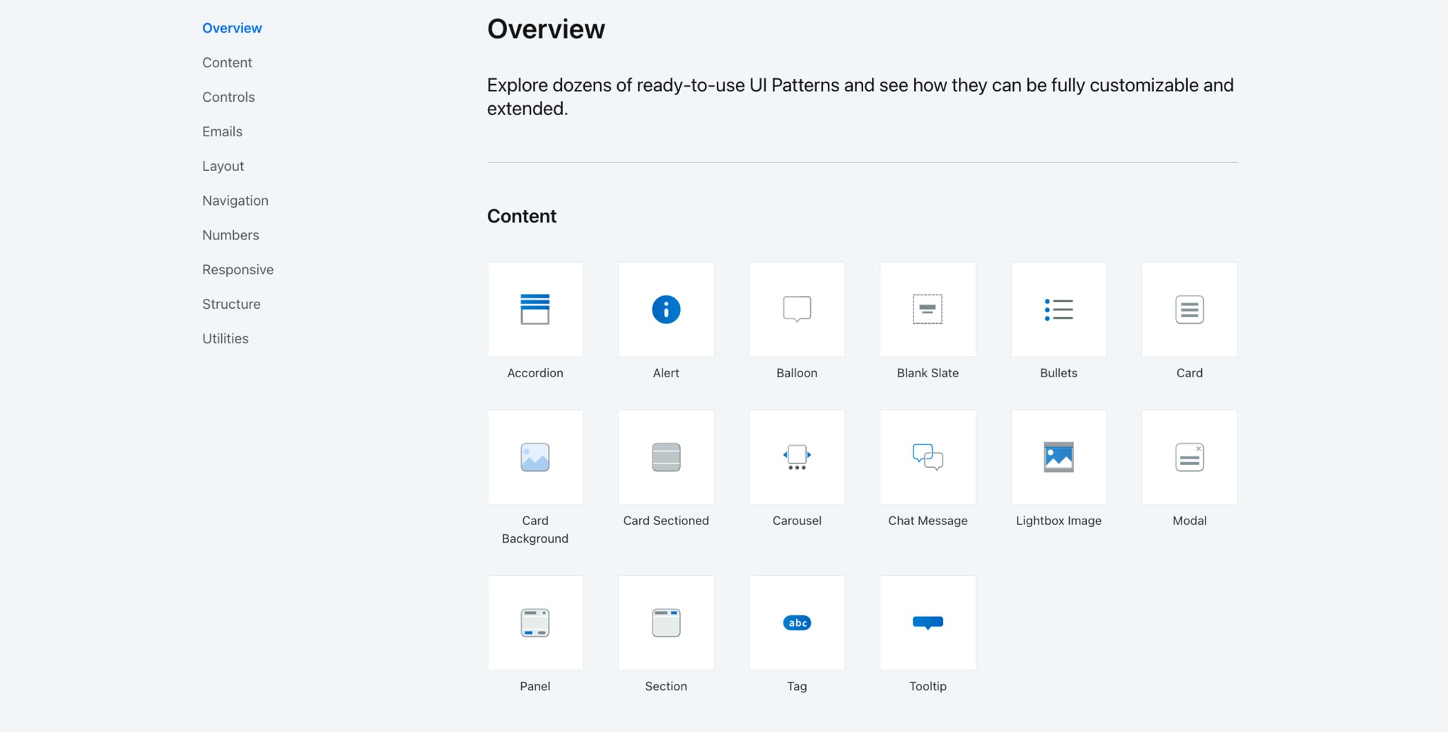
OutSystems Ready-to-Use UI Patterns
Technical Challenges
Designers faced the challenge of working within the constraints of OutSystems, a low-code platform. Balancing design customization with development feasibility was crucial to ensure timely execution while maintaining design integrity.
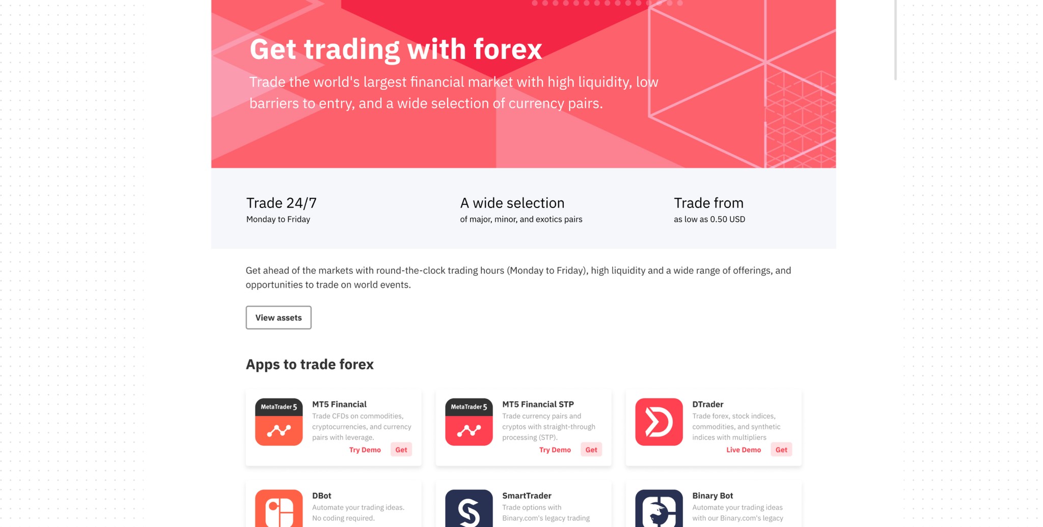
The Importance of the Explore Page
We recognize the critical role of the Explore page in user education and experience. Given this understanding, I've decided to dedicate more time and focus to perfecting the Explore pages. Our next step will involve thorough testing with novice traders to ensure these pages effectively aid in their learning and improve their overall experience.
Below, you can see the initial versions of the Explore pages we developed earlier. Viewing these drafts motivates me to complete and validate them through real user testing.
Pages to go under the 'Explore' tab